Change the name, expand the mission.
Relaunching a brand to make it bigger.
When people think of homelessness in America, they often think of adults. But there’s another, more vulnerable, population out there: LGBTQ+ youth. Some are as young as 12 years old.
A few years ago, a local Milwaukee organization sprang up to deal with this problem. Courage MKE began small by helping Milwaukee kids one by one by providing housing, scholarships, community education, trauma-informed care and many other resources.
But this problem is much bigger than Milwaukee, and the organization eventually felt that its name and branding was holding it back. It needed a brand relaunch.
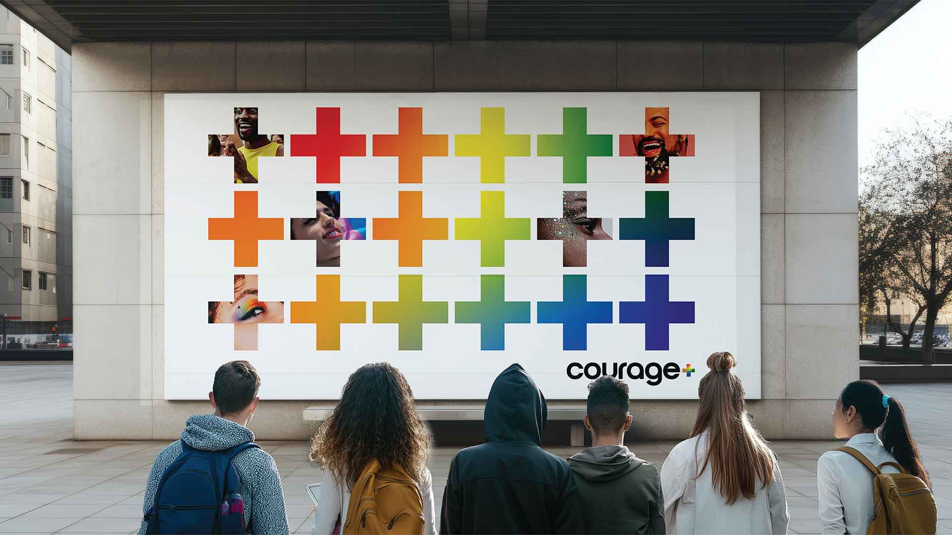
From MKE to +
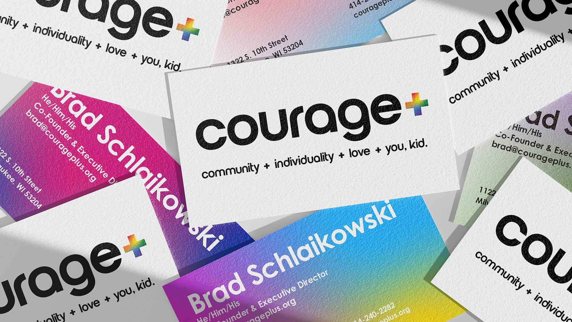
We started by changing the Courage MKE name. We wanted to keep Courage for two reasons; it had some equity, and we didn’t want to risk confusing donors or clients. The issue was that “MKE” limited us to the Milwaukee area.
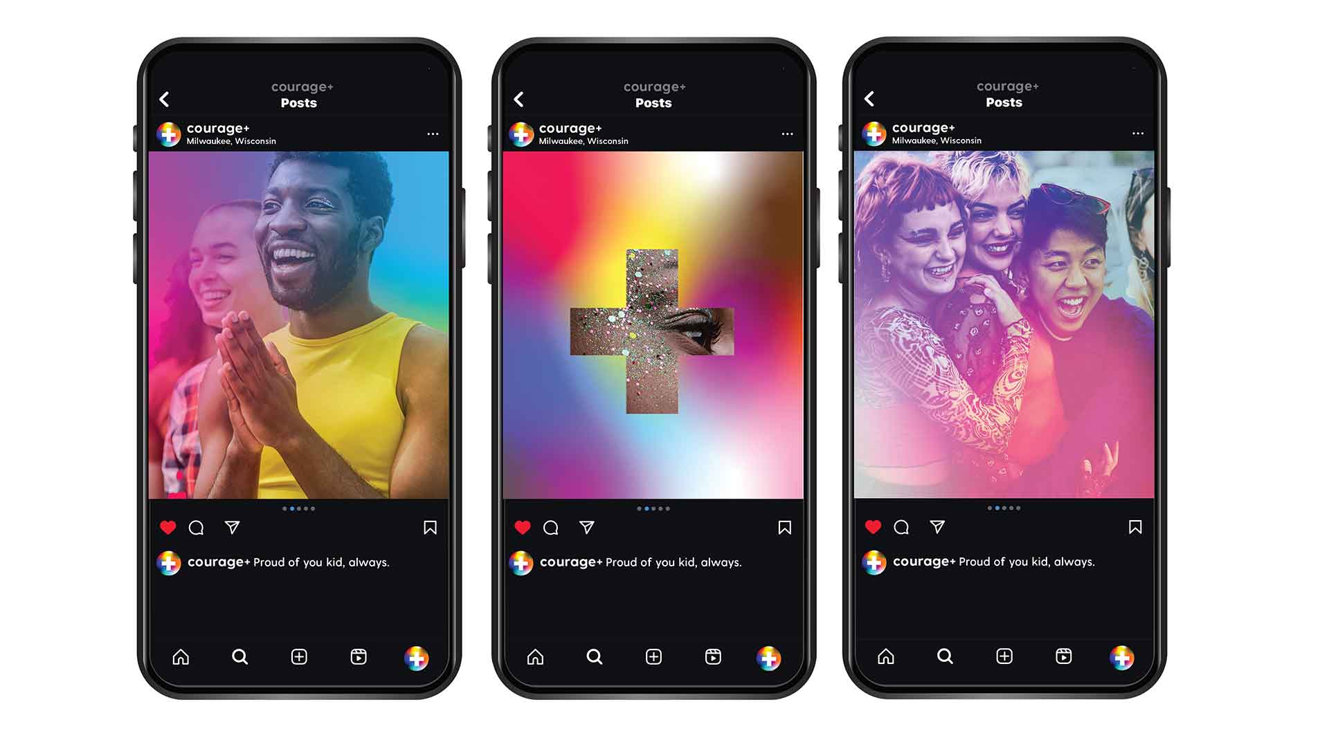
But if we kept Courage and removed MKE, what would we replace it with? The answer: The plus sign that is part of LGBTQ+.
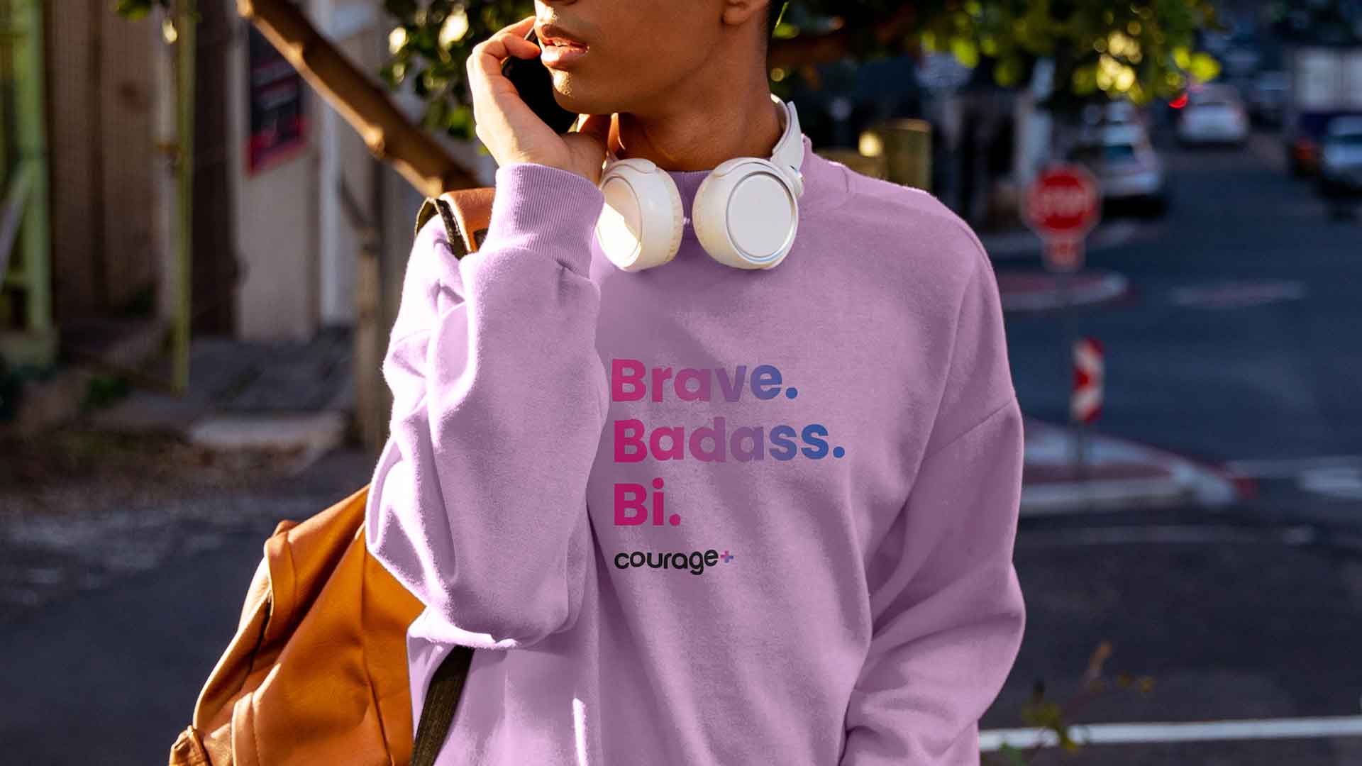
We designed the entire new brand identity to appeal to two distinct audiences: donors and LGBTQ+ youth. We made our designs simple and iconic yet filled with color, movement and energy from the most iconic symbol of queer pride: the rainbow flag.
A stunning debut
Our unveiling of the relaunched brand at the client’s annual gala drove the largest fundraising event in the organization’s history: a 62% increase over the prior year. It was an incredible evening for an organization that makes a real difference for at-risk youths.
And we’re just getting started.