Crisp
Redesigning a super-premium tech brand.
Challenge
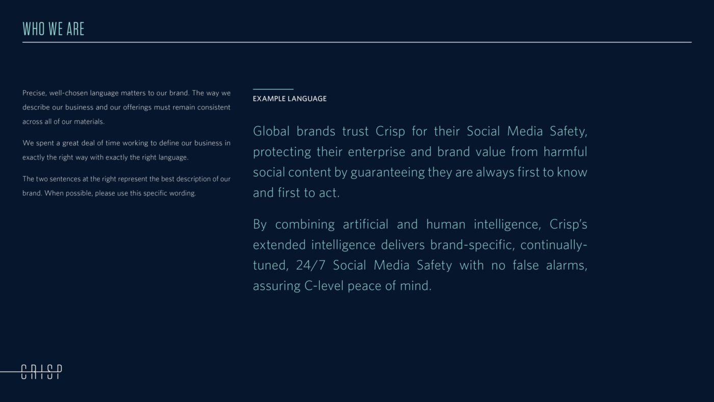
Based in Leeds, UK, Crisp wanted to expand the footprint of its world-leading social media safety solutions more broadly in the U.S. With an unmatched combination of security-grade AI and human risk analysts, Crisp needed a new brand identity that reflected the service’s exceptional quality.
Solution
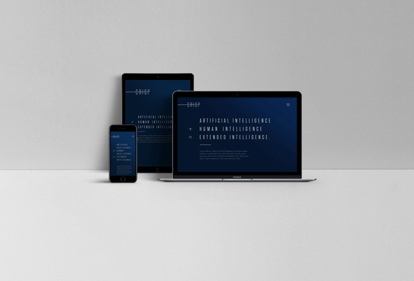
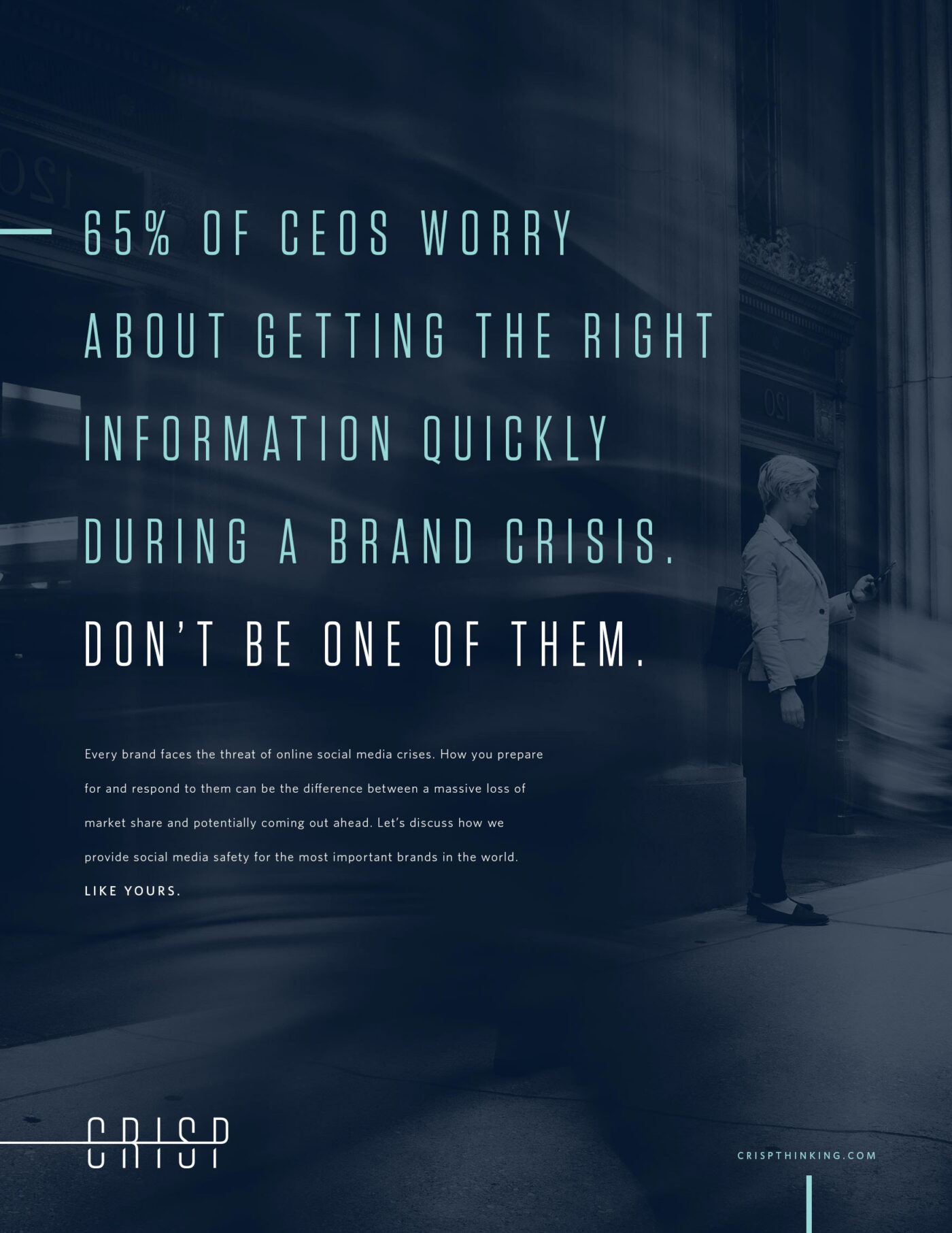
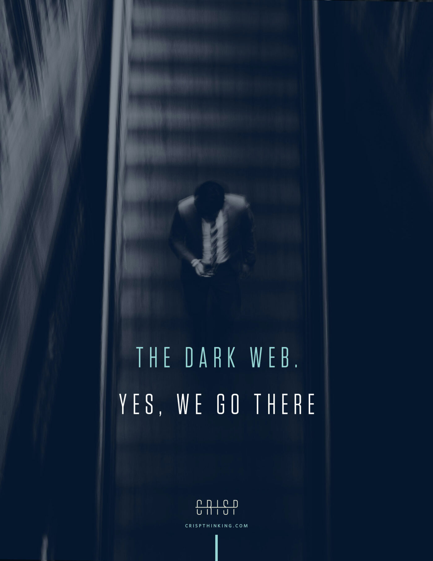
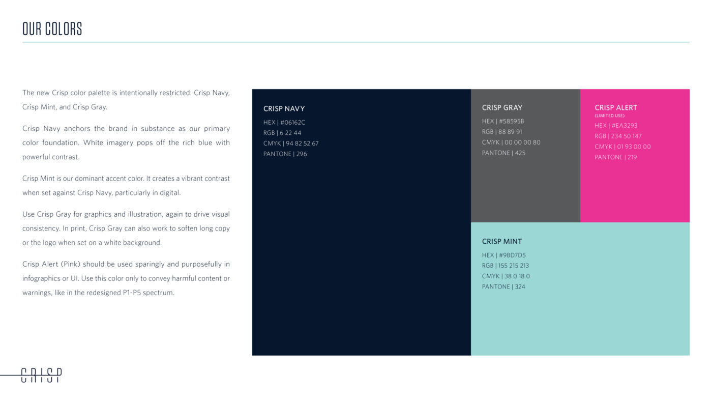
We developed a new logo and an entirely new identity system: colors, fonts, layouts and graphics. We also produced an image library of over 300 photographs, creating a distinctive look of blurred motion in urban environments to represent Crisp’s always-on, constantly moving nature.
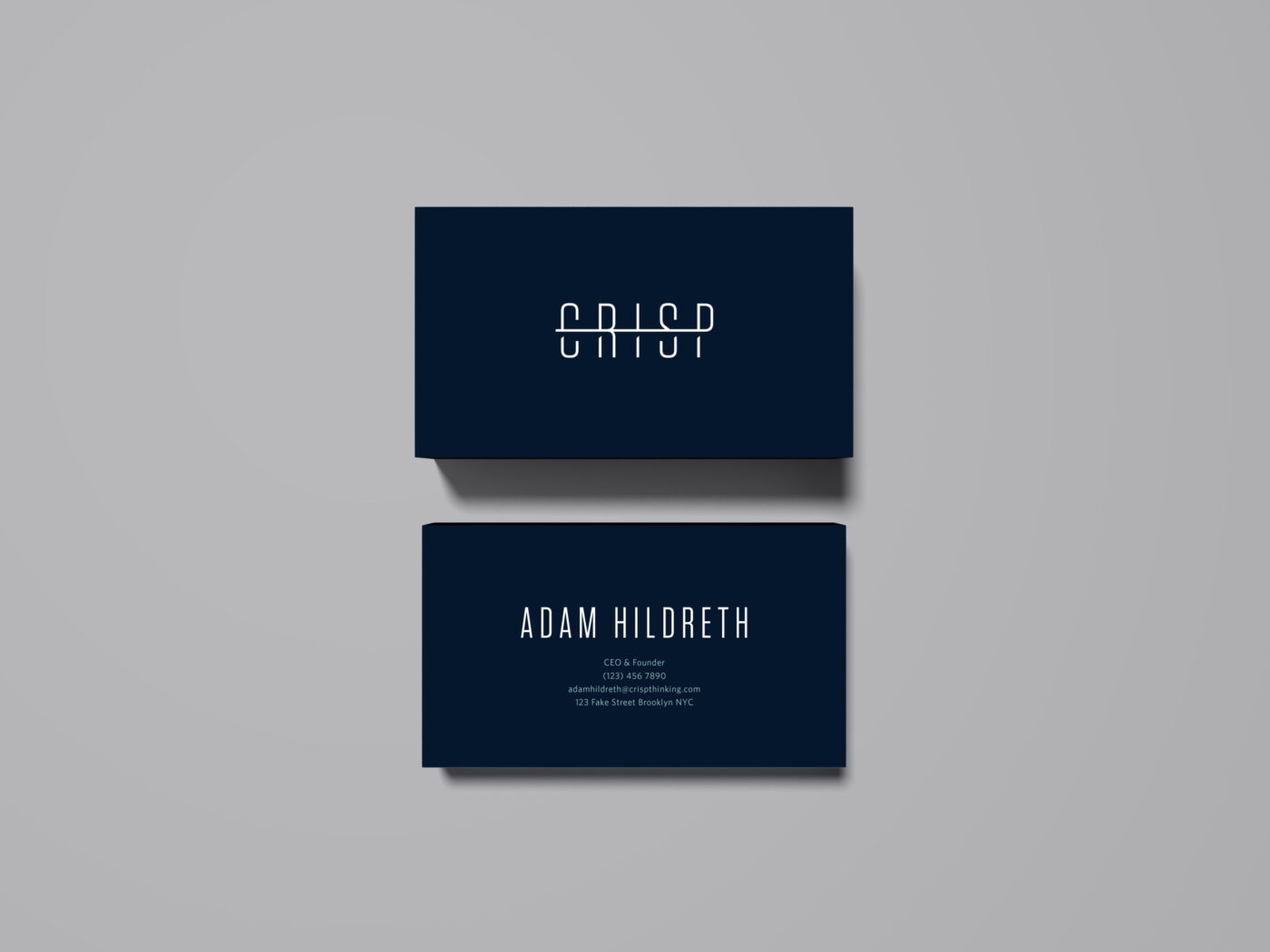
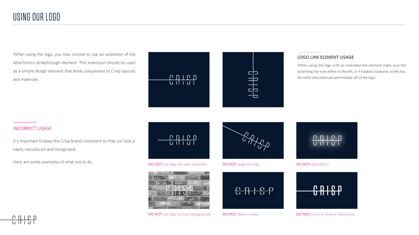
An elegant, precise and purposeful logo.
The singular horizontal line that divides the two halves of the letterforms represents the inexorable vigilance power of Crisp’s always-on AI. Creating shadows under that line lends the logo dimension and strength.
A comprehensive style guide drives brand consistency.
We created an online style guide to inform Crisp’s internal team in Leeds, along with its risk analysts and representatives around the globe. We update this guide regularly, evolving as new needs arise to ensure brand consistency in voice and look.
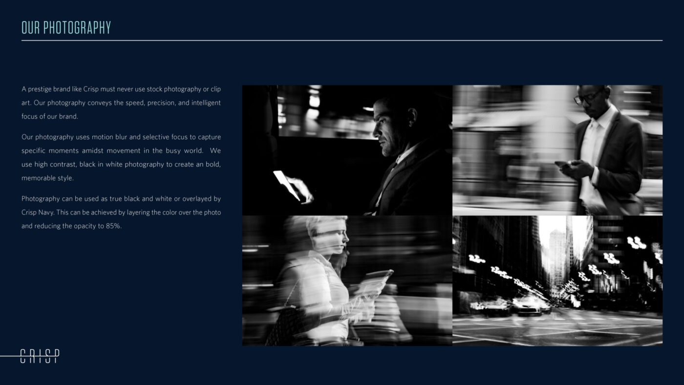
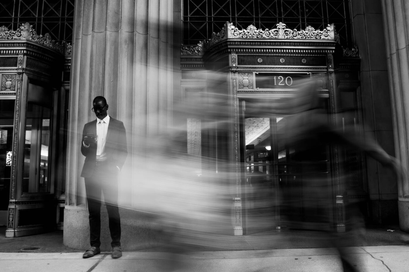
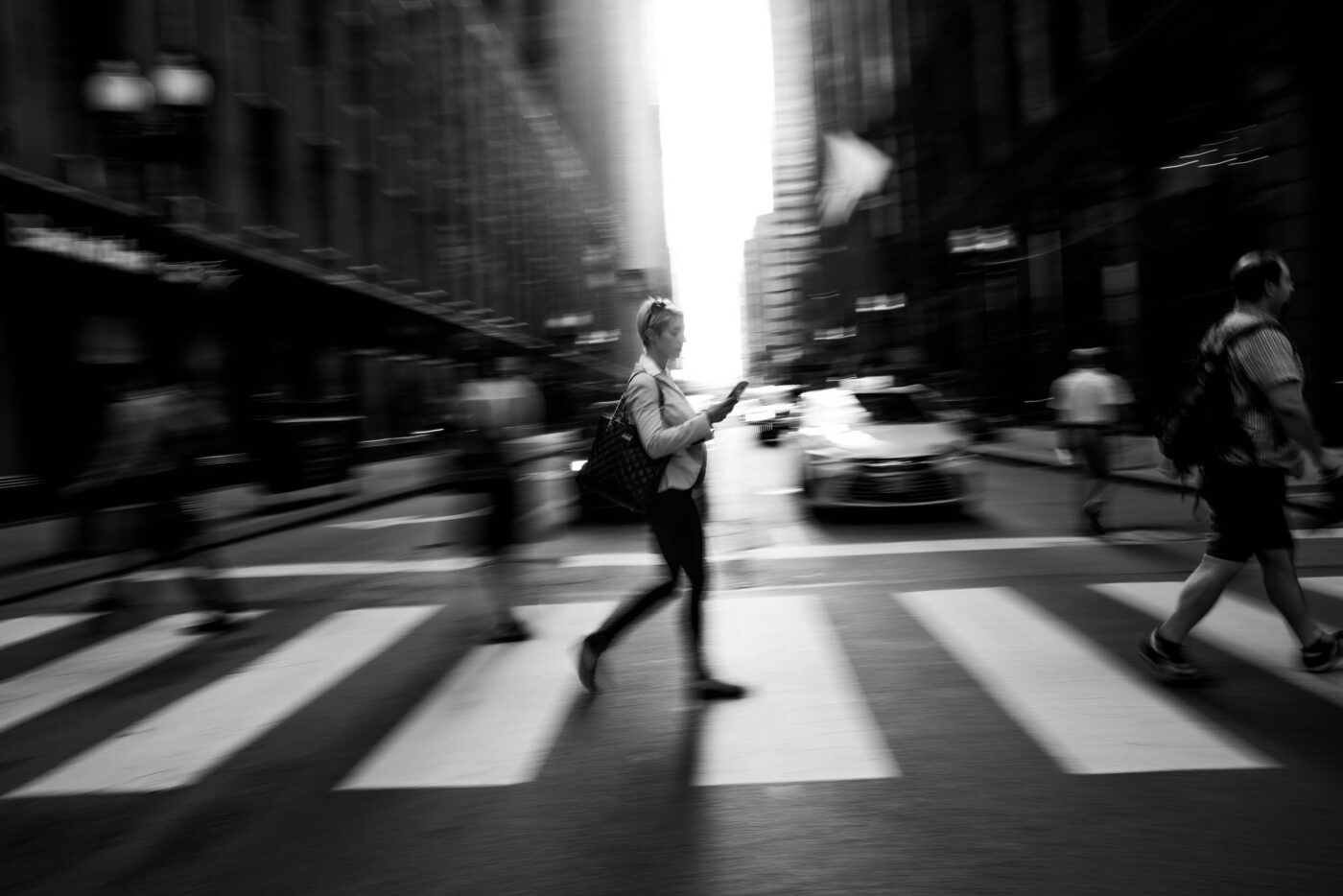
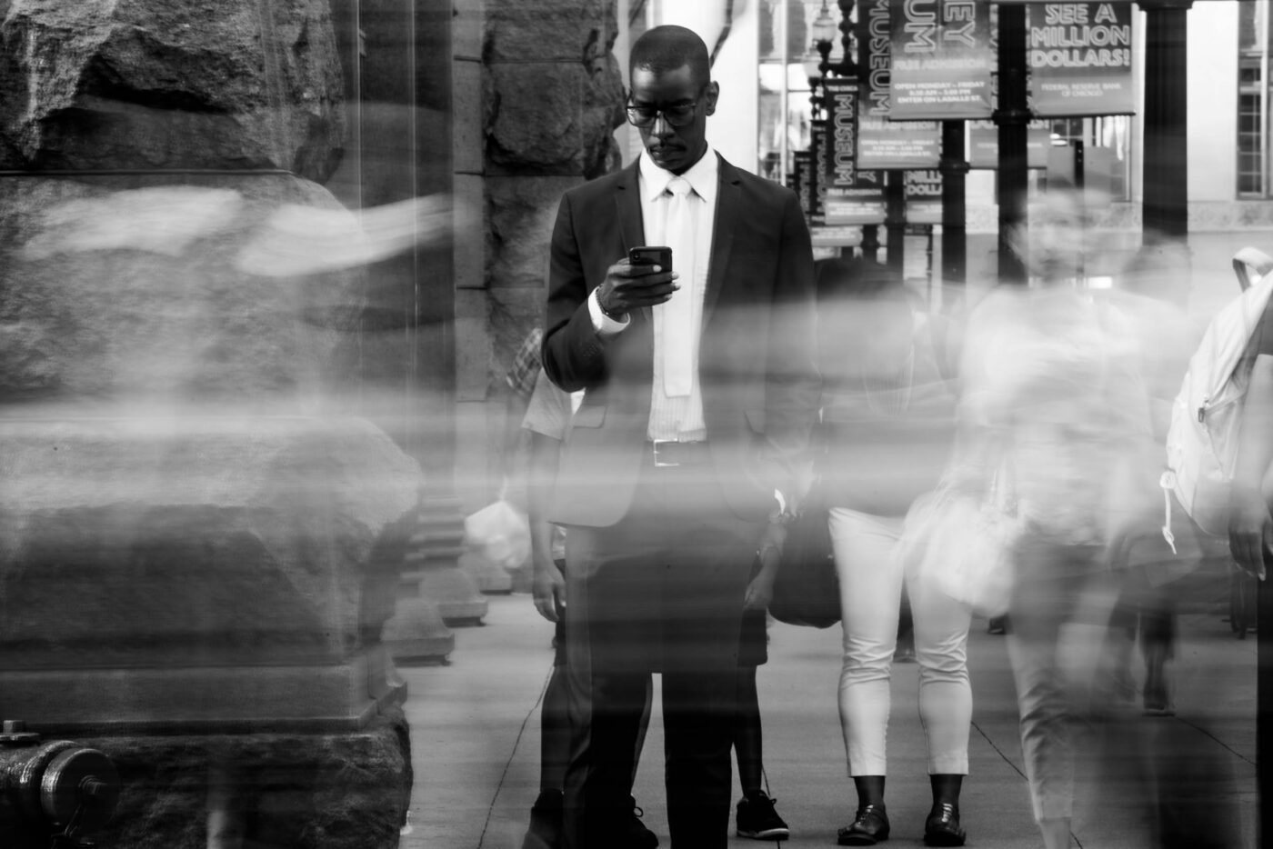
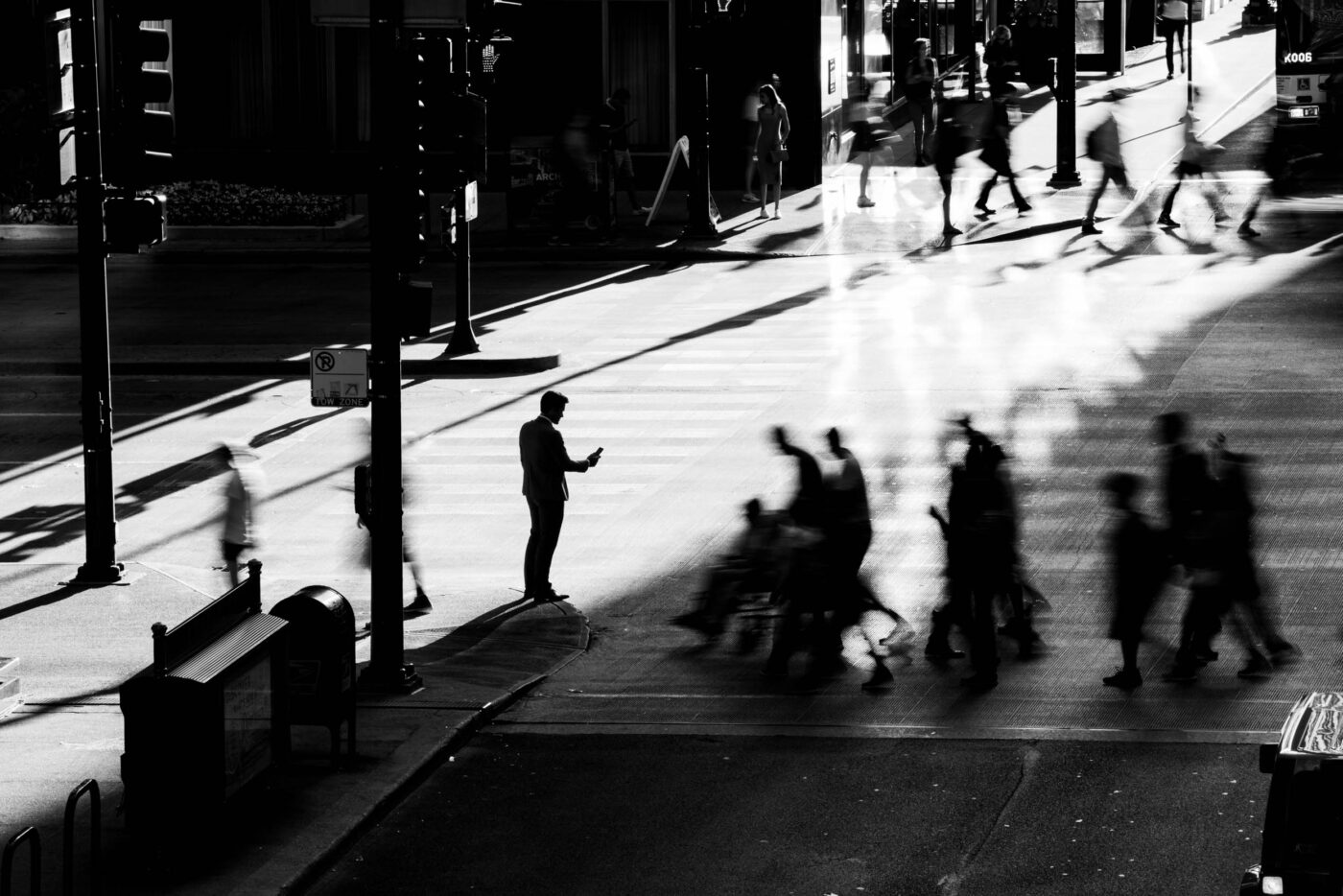
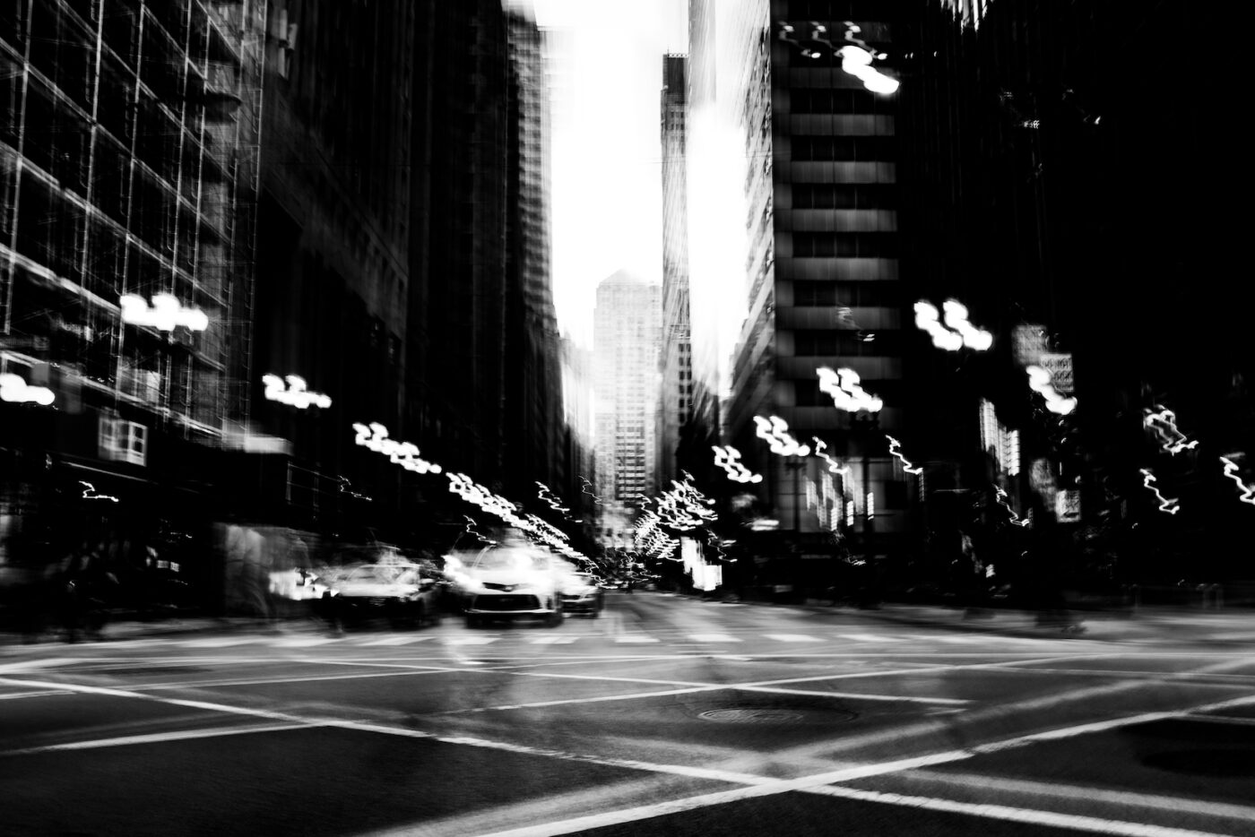
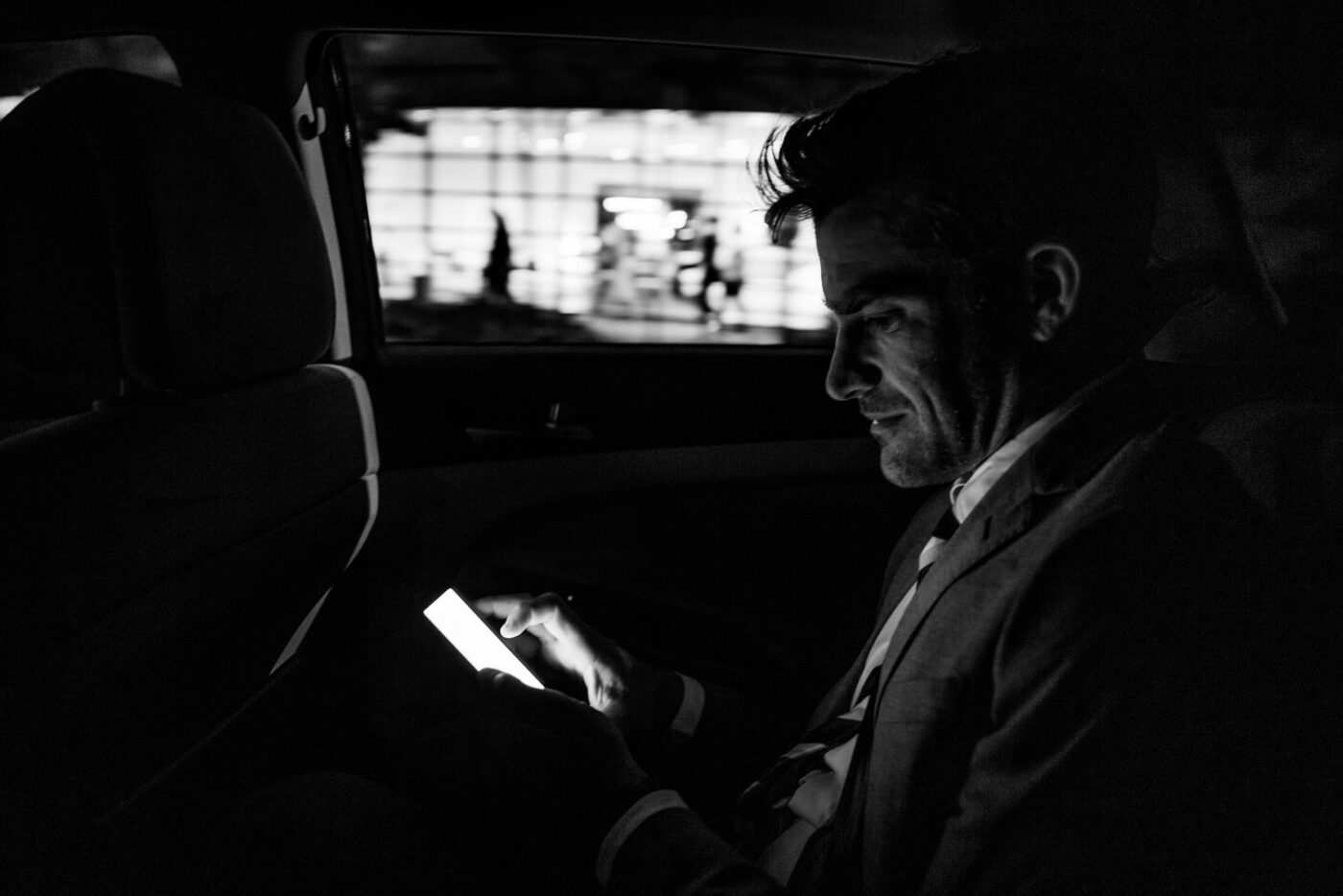
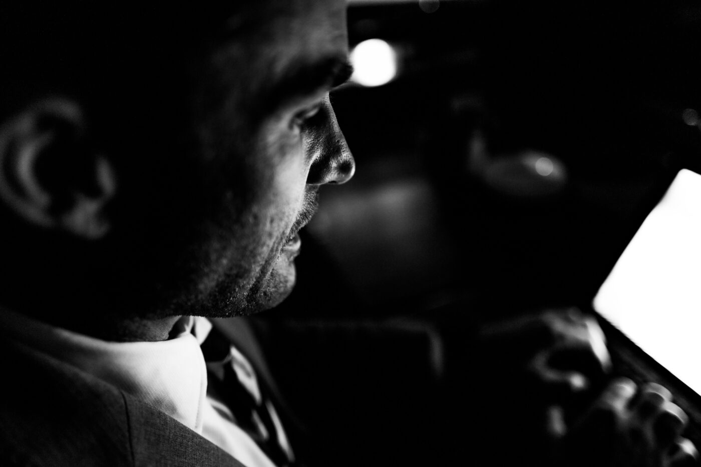
Creating an original on-brand photo library.
Over two days in Chicago, we generated more than 300 black-and-white images for advertising, social media and presentation decks. Using motion blur and select focus, the shots capture a distinctive look of mobile tech in constant motion.


Expressing the new brand at every touchpoint.
While we introduced the new look at an offsite company meeting, a makeover team removed every vestige of the old branding from the office, so that when everyone returned, the new Crisp brand shone from every wall and every desk.