News
More than a resize: design for social media.
Tips for social storytelling
Social media creates design opportunities you don’t have in other channels. Sure, you could simply resize units to fit the space — and in some cases, this may be the perfect approach — but there also are exciting opportunities to think differently about creative and story flow with social media tactics.
And who better to tell you about how we design for social media campaigns than members of our own creative team? Here are three things they consider when designing assets for social:
1. Bring the story to life.
Social media lets us breathe a story out in a different way than other mediums. We need to think not only about what will captivate someone but also what will keep them engaged and moving through the story. For example, you can bleed an image off from one panel to the next in a carousel, inviting people to scroll and telling the story in a more exciting way.
2. Use color to slow the scroll.
Color is always important, but we like looking at which colors stop you and are digitally vibrant. It’s a small space, and you need to make the best use of it. We use brand colors in different ways for social than for print. Introducing things like gradients can have stopping power and help fulfill the brand mission. Seeing a bold pop of color within a headline might seem strange in print, but on social, people are used to seeing vibrant palettes. Use them!
3. Make it move.
A little movement goes a long way. You can lean into existing photography and add subtle movement with animation to help it stand out on social. Animation and video also are great ways to get around limitations of post sizes and aspect ratios since movement allows you to show expansive landscapes or travel from the ground all the way up through the clouds.
Social is ALWAYS evolving.
Seemingly every week, there is something changing across platforms that makes it easier for people to tell stories in a unique way. A feature that works on one platform might show up on another a few months later. You can see what features are available across channels to use in multiple places and streamline when you can.
Collaborating with our social strategy team helps us stay on top of what’s available, what we can use in multiple places and where we’ll need to create something specific for a social channel.
The options in social media to serve and target our audience with content open up exciting possibilities for design. Social media should be separated from your print and media placements to truly see the storytelling possibilities.
About the Author
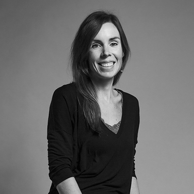
Erin Pine-Moore came to Bader Rutter as an associate creative director three years ago, with 15-plus years of design, marketing and mentorship experience. Her background ranges from set design and photo/video direction to social and digital design. Although her primary focus is design, her love of copywriting and a strategic approach make her a flexible member of the team. Erin is passionate about finding ways to communicate more effectively — and beautifully — through design. In her free time, she can be found working on identifying and caring for the many plants in her backyard or walking a trail with her young daughter, Jade.

About the Author
Jason Ludtke is a designer working across several of Bader Rutter’s clients in different industries. Jason thrives with teams large and small, and his passion for illustration, lettering and art direction can be seen coming to life in the diverse and exciting work that BR does. Outside of BR, Jason can often be found running and cycling around Milwaukee, catching a live show at any number of its excellent venues or grabbing an Americano at any of our fair city’s wonderful coffee shops.
