Farmers Hen House
Intelligently updating a familiar package.
Updating without alienating:
a sensitive brand refresh
People who buy the Farmers Hen House brand of free-range, organic free-range, and pasture-raised eggs from small family farms are very loyal. So, when the brand decided to expand into the traditional grocery channel, our job was to update their homegrown packaging without alienating their devoted following.
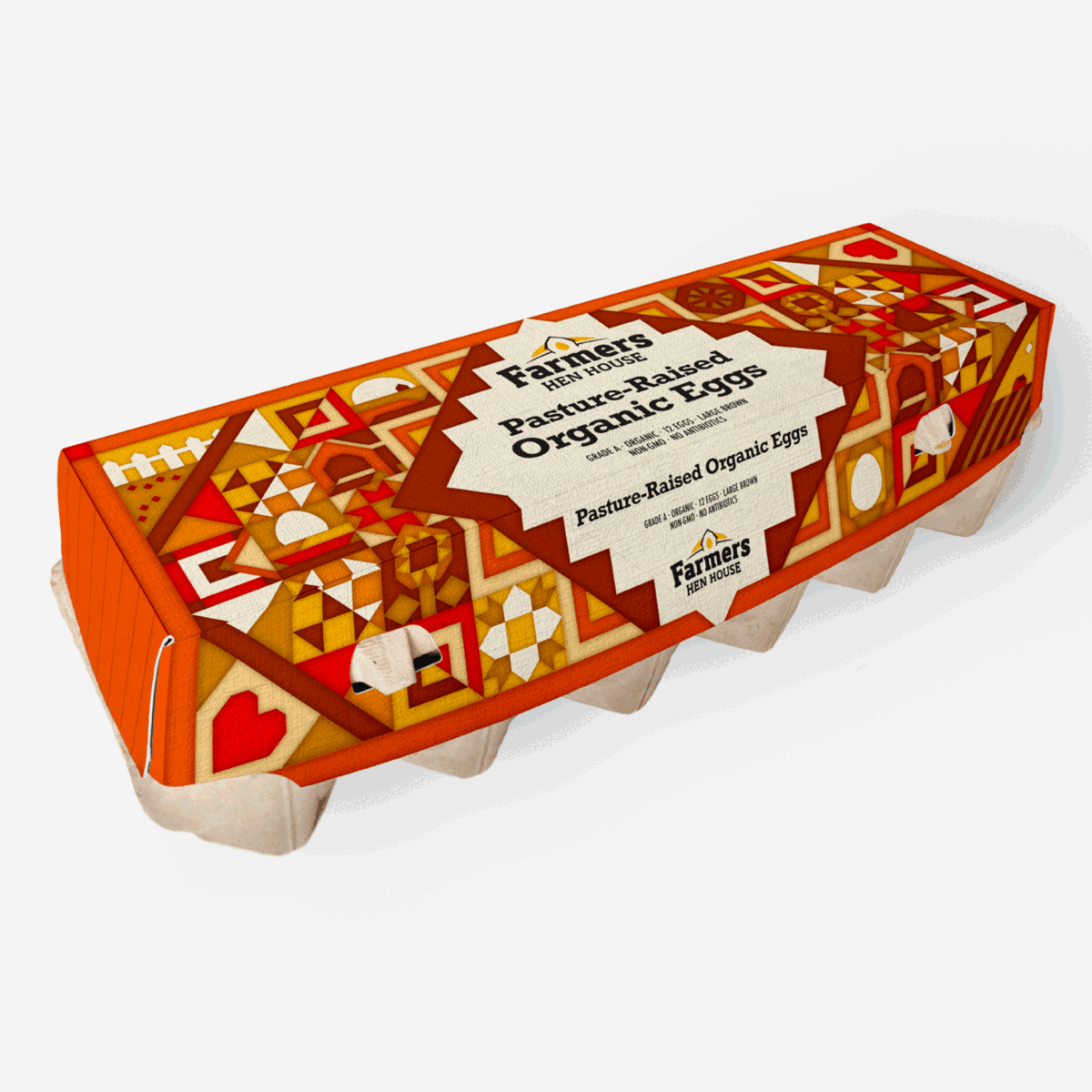
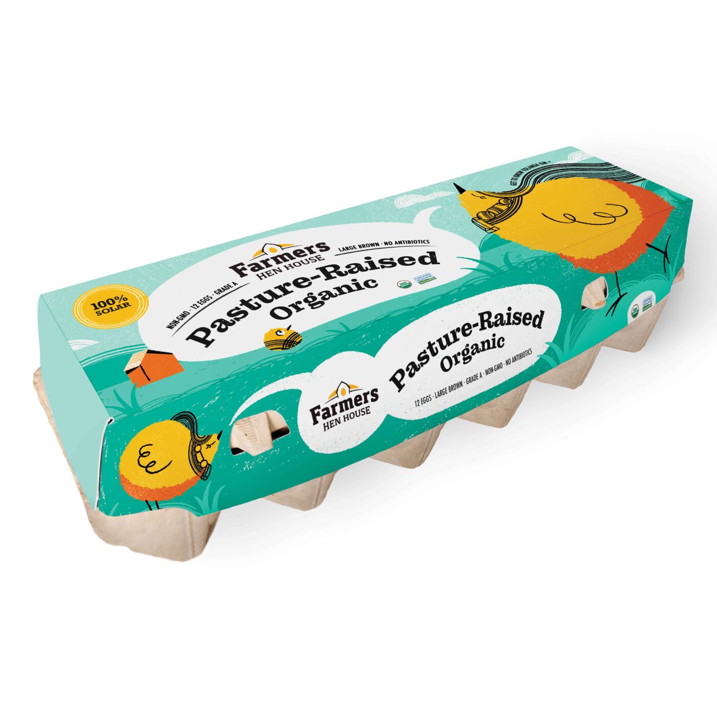
A broad exploration of a tight design strategy
After our consumer research revealed premium egg buyers look for certain attributes even before brand, we focused on creating packaging that communicated healthy hens and nutritious eggs.
Our designers explored a wide variety of approaches, from farmstand earnestness to original illustrations, bold typography to punchy new colors and even some quirky, wholesome anthropomorphic personas for the hens.
Testing and optimizing
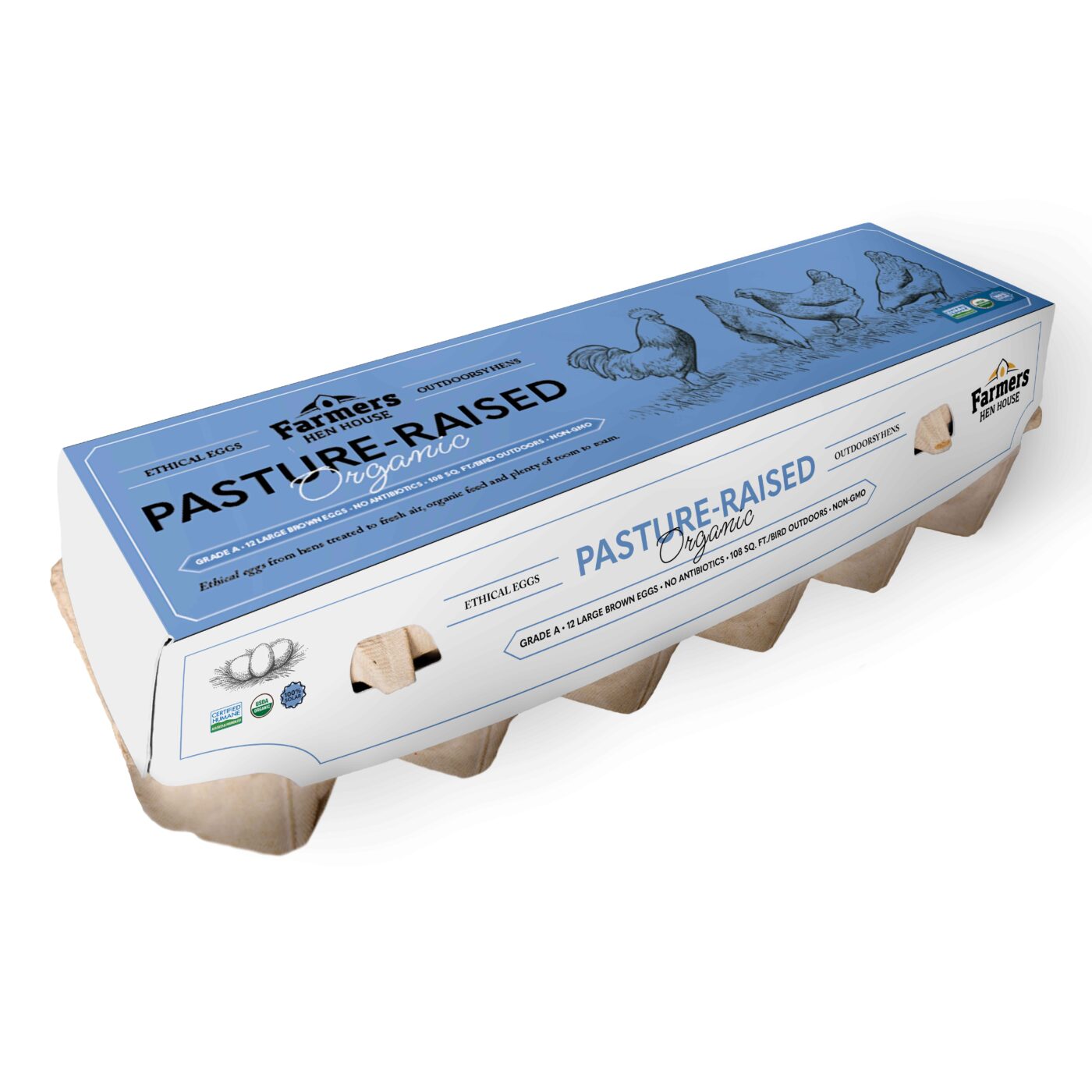
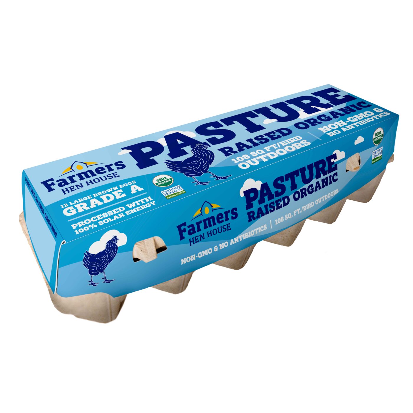
After developing eight initial designs, we tested three, which revealed two finalists. The client then hired Nielsen to conduct eye scan preference testing on our two new designs and their existing box.
We were confident in our work but admittedly relieved when one of ours emerged as the clear favorite.
A winning new design
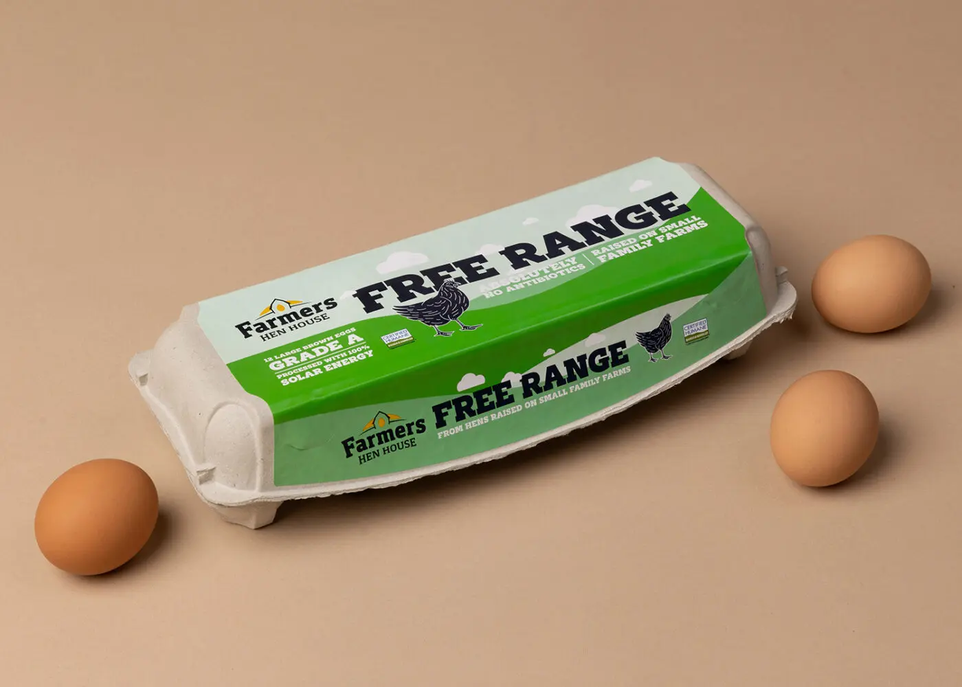
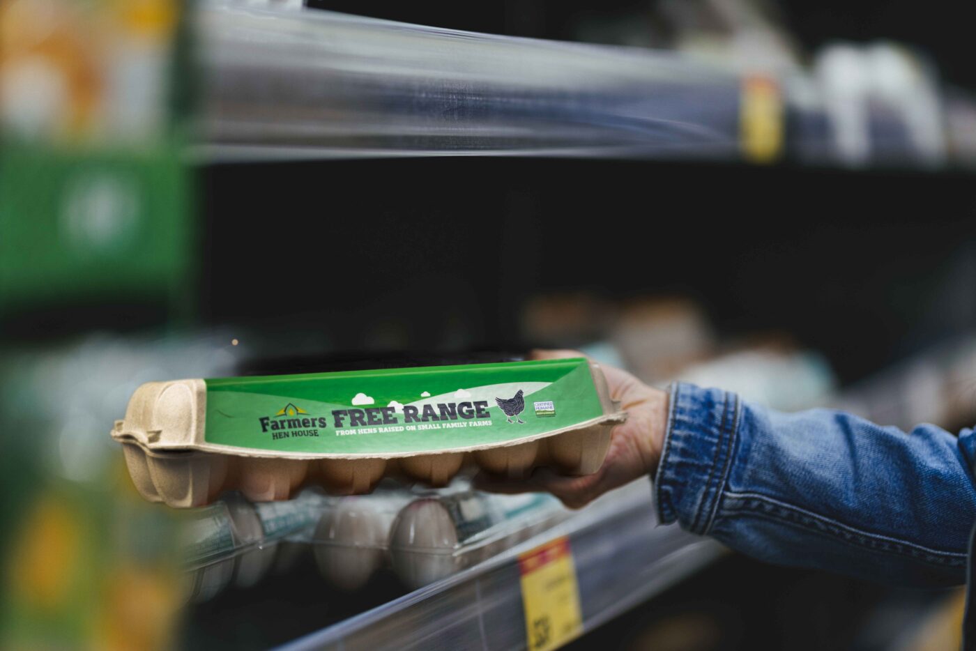
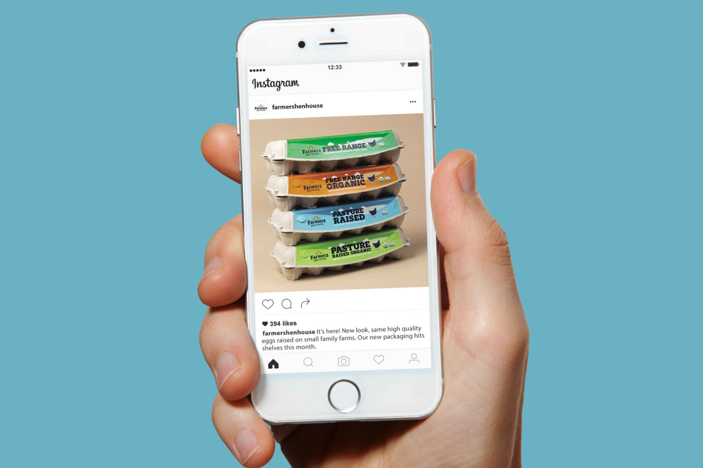
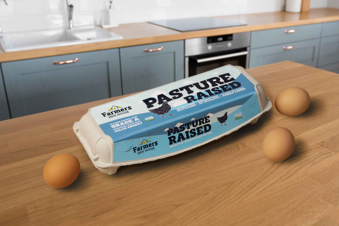
Our winning solution paired sunny pastures with bold, attention-grabbing product claims to attract premium egg buyers.
So, how do you like your eggs?